
Red Giraffe Designs
Being in charge of online operations at RGD, I had creative freedom to design new pages as the business expanded. Pages would range from product material information to donation events and everything in between. Pages are made through Square, graphics are done in Canva and Adobe Illustrator, wireframes are done in Figma.
Explore the site here.


Each page starts out as a wireframe where I can sketch out rough ideas for what I want the page to contain while maintaining a flow for the user.
This specific page details RGD’s yearly charity event in April, where the business donates money to local cancer organizations in honor of the business owner’s mother who passed away after battling cancer.
I wanted to start the page off with a brief explanation of our month long goal for those new to the business, followed by the specific promotion we’ll be running alongside any additional info (in this case, a link to a form).
After, I follow up with information for an event that will drive our donation to a local cancer organization.
Last, I end with another quote from the owner about her personal experience to show the user and customer that this is close to home and we truly care about the cause we’re fighting for.
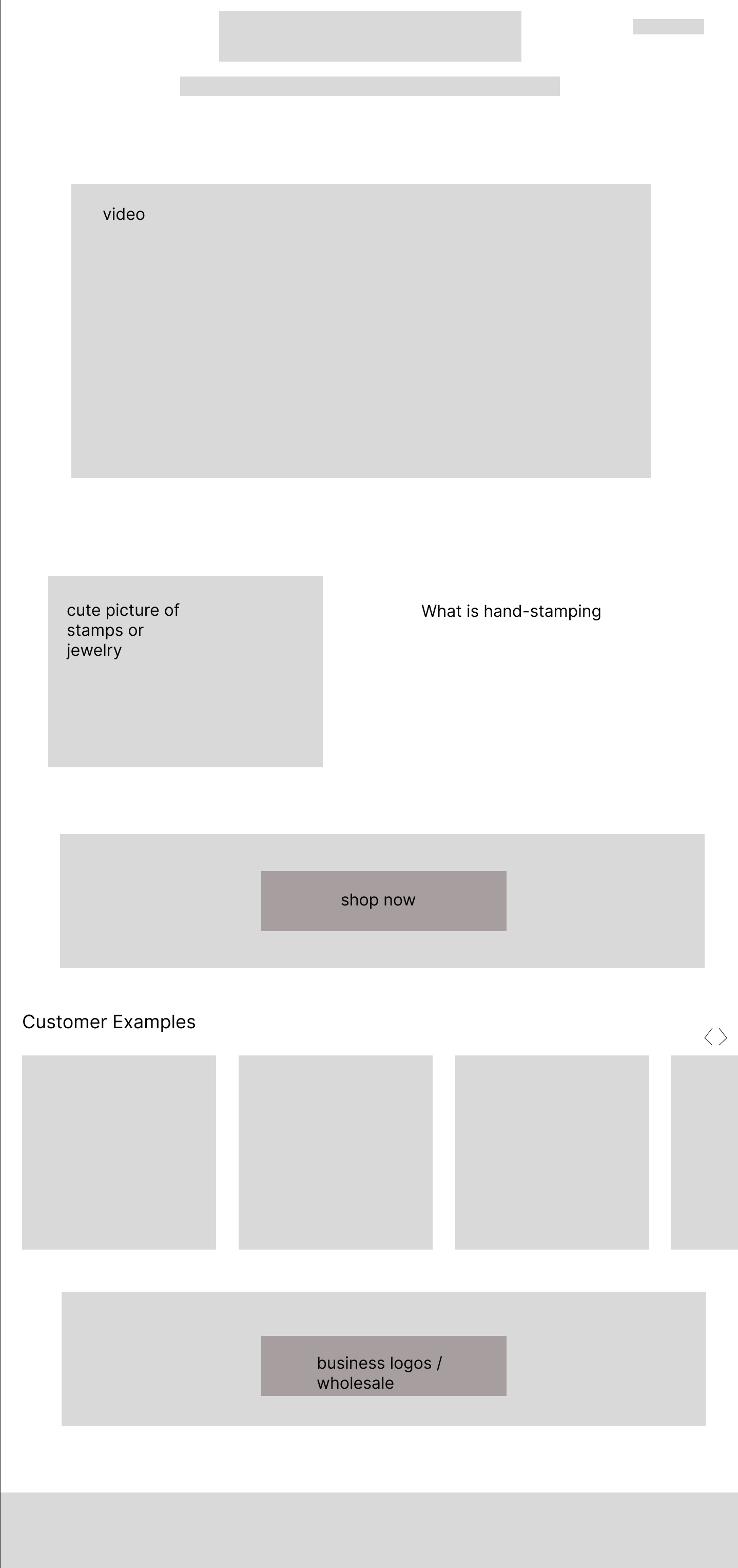

This page covers any information about the business’ custom hand-stamping services. My goal for this page was to provide a quick explanation to the process that is helpful but concise.
The video at the top goes over the process very thoroughly, because of this, I can rely more on photos and other visual components than lengthy text blocks. Due to the video’s importance to the explanation of hand-stamping and brevity, it was put at the top of the page.
Many customers who come into the stores ask what others get on their pieces, or what is popular. I added a carousel of photos from over the years of custom orders to give the online customer some inspiration. This also shows the possibilities of what we can make as a company and will encourage customers to add extra necklace charms, upgrade chains, and add additional items to their cart that replicate the look of these examples.


These next two pages go hand in hand as information for customers to better understand the materials the products we sell are made out of and how to take care of and clean them - aptly named “materials” and “jewelry care”.
Ideally, these pages would utilize collapsable text with drop down arrows, however Square does not allow for that feature. This hurdle made me realize the importance of the hierarchies of text within the page and how to make sections clear. I took advantage of font size, bold text, capitalization, page orientation, and images to help delineate metal categories and the specific metals that fell under those categories.
The images next to each of the metals breaks the text enough to make the amount of information still seem consumable without being overwhelming. The large, bold text also helps the user find the specific information they are looking for easily.
Since these two page’s information feeds into one another, there is a link to the other page for additional reading if the user wishes.
Since the business offers a wide variety of materials, I thought it would be best to include a shopping guide for customers to use when they aren’t sure which metal best fits their needs. This guide went through several iterations to be easily read and understood. Changes such as reducing the amount of columns, making colors of the answer dots have more contrast and visual difference to be easily told apart.

In the summer of 2022 we introduced a new service - Forever Jewelry, which is chain based jewelry pieces (necklaces, bracelets, anklets, etc) without a clasp so it never needs to be taken off. Due to its popularity and the amount of interest the business has received (and continues to receive), I wanted to make a thorough page dedicated to any and everything related to Forever Jewelry.
The most questions the business gets asked is how it works, the materials, and appointment options. I knew I wanted to make those their own sections with bold text to be easily findable. Any other questions can be found at the bottom of the page in an FAQ style format. Again, due to the limitations of Square, I wasn’t able to use drop down arrows to condense the text, instead I used bold text and spacing to differentiate questions.
I took advantage of hyperlinking any text that could lead to another page as well. From the store locations, to more information on materials, to our contact page. This helps provide additional information without adding more lengthy text to the page that would then make the page feel more overwhelming with information.
To break up text blocks, I used images related to the process. I featured the different chain options so customers can get a brief look at the selection before coming into a store. The second image shows an in action shot to give the customer an idea of what the process is going to be.